Sarah Robinson | Tips and Techniques
How to Use a Paint Color Wheel

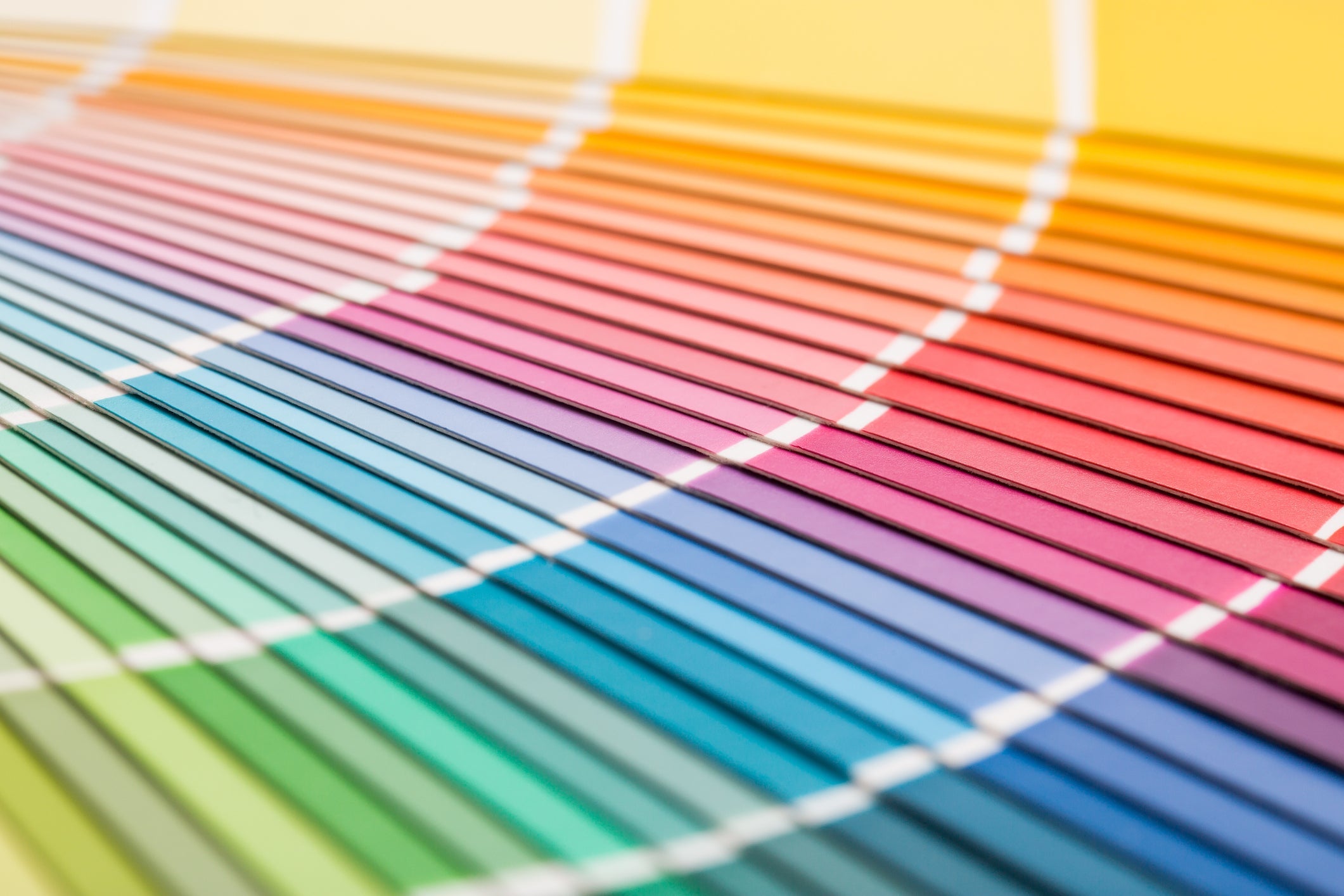
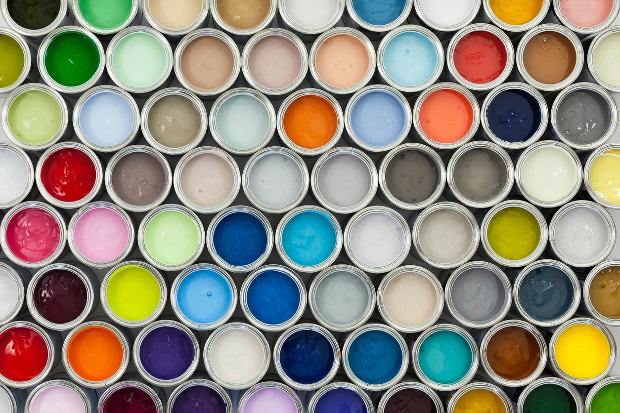
When you're getting ready to paint a room, deciding on a wall color can seem pretty overwhelming. What makes it even more complicated is that you're not just picking one color; you need to create a palette for the space, which includes accent colors for furniture and accessories. The good news is, there is a great tool you can use to help you find the perfect paint colors for your space. It's called the Color Wheel, and once you know how to a color wheel, you'll find the whole process of choosing a color scheme to be much easier.
Learn the basics of using a color wheel:
- Learn the dimensions of color
- Primary, secondary and tertiary colors
- Different color schemes
- Warm colors vs cool colors
Dimensions of Color
There's so much more to color than just a name. Each color has dimensions that help create a different version of the same color. In order to use the color wheel, it's helpful to understand some basic terms. Let's take a look at some common color terminology that we see on the color wheel.
- Hue: The hue of a color refers to the basic color. For example, blue is the hue present in both light blue and dark blue.
- Tint: A tint is the mixture of a color with white, which increases lightness
- Shade: A shade is the mixture of a color with black, which reduces lightness
- Tone: Tone is the result of adding gray to a color to change the saturation. You can also adjust the tone by both tinting and shading in separate processes.
- Value: The value describes the amount of white or black present in the color. Values range from light to dark on a gray scale
- Saturation: This refers to a color's strength or weakness in a different light. Think about it in terms of bright or dull.
 Using the Color Wheel
 Using the Color Wheel
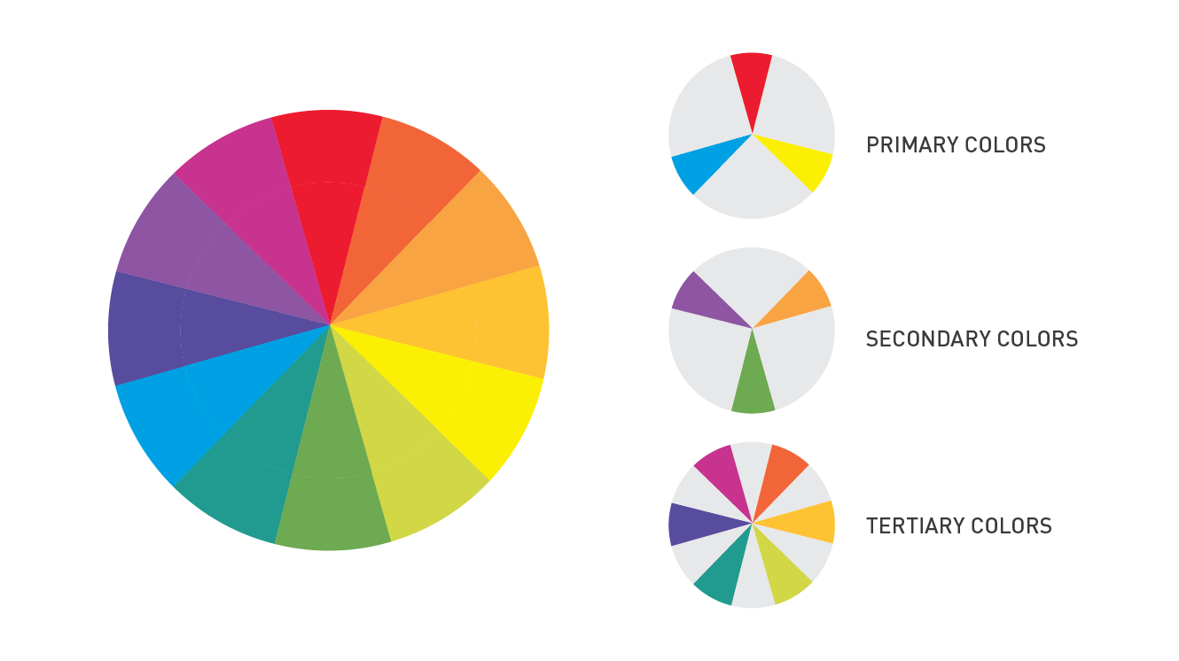
The traditional color wheel is made up of 12 different hues. One half of the wheel features cool colors, while the other half features warm colors. The wheels are further broken down into the following classifications: 1. Primary Colors; 2. Secondary Colors; and 3. Tertiary Colors.
Primary Colors
All colors are based on primary colors, with the exception of white. There are 3 primary colors: blue, yellow and red. Combinations of these three colors produce what are called secondary colors.
Secondary Colors
When you mix equal amounts of two primary colors, you get secondary colors. The possible mixtures create the secondary colors of violet (red and blue), green (blue and yellow) and orange (red and yellow).
Tertiary Colors
When you mix primary colors in unequal amounts, you create tertiary colors. For example, mixing one part blue with two parts red makes red-violet.
Monochromatic Color Scheme
A monochromatic color scheme is made up of colors with the same hue but in different tones, values, and saturation. It's almost like a gradient, or what you see when you look at a paint swatch card. For example, if you were working with red, you could choose a mix of reds from dark to light. Monochromatic rooms work well for those who want to experiment with color, but don't want to get too crazy.
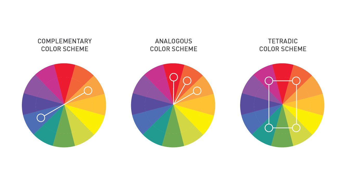
Complementary Color Scheme
Colors that lie on opposite sides of the color wheel are called complementary colors. This type of color pairing creates a great balance in a space since each color brings out the richness in the other. When working with complementary colors, it's best to choose one color to be the more dominant one. For example, an intense, dark violet should be paired with a medium to light yellow.
Another pairing in this type of color scheme is split complementary colors. This palette offers more of a bold contrast. To achieve this look, start with your main color, then find the complementary color and select colors from each side of the complementary color. For example, if green is your base color, you would pair it with pink and orange, since they are next to red, which is the complementary color for green.
Analogous Color Scheme
The analogous color scheme is made by pairing any 3 colors that lie next to each other on the color wheel. This color scheme is easy to master for anyone since the colors will always form a progression of warm and cool. For example, a light green, brighter true green, and a light blue.
Triadic Color Scheme
A triadic color scheme is made up of any 3 colors that are spaced evenly apart from one another on the wheel. Triad palettes are often quite vibrant, so it's best to choose one dominant color and use the other two as accents. Keep in mind that they can still seem quite vibrant even if you use pale or unsaturated versions of each color.
Tetradic Color Scheme
Tetradic color schemes are created by choosing 4 colors that form a rectangle on the wheel. This gives you 2 pairs of complementary colors and gives you a ton of potential palettes to work with. This color scheme works best when you use one main color as a base and use the others as accents, which creates a better balance since they're not all competing with each other. It's also important to be mindful of the balance of warm and cool colors since you don't want your space to feel too busy.
Warm Colors vs Cool Colors
When you split it in half down the center, the color wheel gives us one half featuring warm colors and the other featuring cool colors. A great way to remember which colors fall into each category is to think of the warm colors associated with daylight or a sunset, and cool colors associated with a gray or overcast day.
On the right side of the wheel, you have warmer colors. These colors offer up that warm and cozy feeling we want in spaces where we like to relax. These colors include red through yellow, with browns and tans included. Here are some examples of warm colors and how they can impact a room:
- Red is very energizing and is a great choice for a room where you want to encourage socializing.
- Orange is a little less aggressive than red, but is still super high energy and adds a sense of fun and playfulness to a space
- Yellow is very happy and uplifting, but can also be a bit overwhelming if you use too much of it.
On the left side of the wheel, we have the cool colors. These colors are generally quite soothing and are great for spaces where we need to be able to focus and be calm. This includes the hues from blue green through blue violet, with most grays included. Cool colors promote calmness and a sense of trust. Here are some examples of cool colors and how they can make us feel:
- Green has a strong connection with nature, which makes it quite calming and peaceful.
- Blue is universally known as a calming color and is great for helping us focus and relax.
- Violet or purple has the calming elements of blue, with some of the energy of red. It adds an element of sophistication while still being relaxing.
Once you understand the basics of using a paint color wheel, you can start to create more sophisticated palettes by playing with different elements of each color. For example, you can modify the value (lightness/darkness) and intensity (brightness/dullness) of colors to create combinations that suit your style. Use the color schemes we've talked about and modify your base colors to go more intense, or more subtle and calming. For example, if you want to work with yellow and violet as complementary colors, you can turn it into cream and lavender, or deep gold and amethyst.
Are you ready to paint the interior of your home? Let our professional house painters help! Get a free estimate today.