March 27, 2024 | Design Guides
The Best Paint Colors for Dark Rooms: What Actually Works (And What Doesn't)

The best paint color for a dark room is almost never the brightest white you can find – and that surprises a lot of homeowners. White depends on natural light to reflect properly; without it, white walls can actually look dull, flat, and even dingy. The real answer is more nuanced: warm-toned neutrals, saturated mid-tones, and even some bold darks can make a room with little or no natural light feel intentional, cozy, and more spacious than white ever would. Here's what our professional painters recommend for every dark room scenario.
The Best Paint Colors for Dark Rooms Without Natural Light
If white is off the table for your dark room, what should you be looking for instead? The answer is often warm-toned neutrals. These colors are your best bet for making a dark space seem brighter. Medium tones are ideal, because if you go too dark, the room will seem smaller.
Darker rooms also need colors that are more saturated, since there's less light to be reflected off the color. That means you should look for colors with less black in the base. Also keep in mind that you don't have to use light colors in a room without much light – you should really be looking at brighter colors to bring in some light.
The kind of space you're looking at can make a difference too. For example, you would treat a dark bedroom differently than a hallway. For powder rooms without windows, you can go for much bolder looks since people don't spend as much time in these spaces. (Think dark colors and funky accents.) On the other hand, in a dark hallway, a light to medium neutral is a better choice, since bright colors can make them seem more narrow.
Here are a few of our favorite colors for dark rooms. Keep in mind that the size, shape, and function of the room will dictate which colors work best.
What color paint is best for a dark bedroom?
Many people see a room with little to no natural light and think they must lighten it up. Sure, many people prefer a brighter room and it might be safer for resale value, but embracing the darkness can make a dark room very cozy and elegant. Think smoke gray, dark teal, or chocolate browns.
We recommend going a few shades lighter than you think because once it’s on all the walls (especially in a dark room), it can be very imposing. There are many ways to make a bold paint color work. Don’t be afraid!
How do you make a dark bathroom look brighter?
Many homeowners choose white or off-white for rooms with minimal natural light because they reflect the most light to brighten a dark room. Be careful: artificial lighting can add too many warm yellow undertones or cool blue undertones and you won’t get the true white hue of natural light.
For other colors besides white that reflect light, consider a softer, lighter shade of color like lavender, sunny yellow, powder blue or many others to make a room brighter and add the reflective quality of light while adding a splash of vibrance. Paint can make even small bathrooms feel spacious.
Best Paint Colors for Dark Living Rooms: By Mood and Use
Every family uses their living room differently. For some, it’s a home office. For others, it’s a movie room. Think about the purpose that room serves and the kind of feel you want it to have.
If you use your dark living room as a home office primarily, you might want a more scholarly mood and go for deeper blues or greens. If your family uses the living room for movie nights, you might want to make it warmer and softer with taupe or a muted gray.
Paint Ideas for Dark Hallways: How to Make Them Feel Welcoming
Depending on your house, a hallway can be very busy with people and doorways, but hallways in other houses can be quite vacant. Either way, you can still paint your hallway and make it feel warm and welcoming.
If your hallway is small, dark, and filled with door frames, you want to consider the color of the adjoining rooms and find a lighter hue with some contrast.
If you have a vacant hallway without natural light, consider it an opportunity to dress it up and make a statement with a gallery wall, some visual interest with accent molding, or add some functionality with a wine rack or a wall mount for a guitar. In these scenarios, think about what is going to be hanging on the wall and choose a contrasting color to complement it.
6 Best Paint Colors for Dark Rooms: Our Top Picks
Without natural light, you need to be much more sensitive about the undertones of the color you’re choosing. Choosing paint swatches off your computer screen is futile; you need to get the actual paint swatch, bring it home, and hold it up in the room. You’ll be shocked by how much the colors change in your actual space and without natural light.
Colors like white, gray, and taupe are much more variable with light, so if you’re having trouble with undertones in no natural light, it’s best to pick a vibrant color and go a couple of hues softer than you think for the best color with no natural light.
How to decorate a dark room with no windows
Start by painting the room a bright color. Vibrant hues of yellow or orange are highly visible in dark light. Then incorporate decor like mirrors that reflect other light sources in the room. Try using biophilic design elements like low-light plants, wood, and stone details.
Installing smart LED strip lights underneath bookshelves, toe kicks, around the television, or spotlighting a piece of art gives you a way to add light and adjust the hue to cool it down or warm it up.
If you’re avoiding white walls in your dark room, consider the color of the furniture. Choose white bed frames or dressers, natural wood stains or find high-contrast upholstery to compliment the dark room.
What sheen should you paint a dark room?
Interior paint comes in a variety of sheens from matte (or flat) to high gloss. The most popular finish for paints is called eggshell, which reflects a little light but is still matted (just like an eggshell). Most paint swatches are eggshell and consider eggshell to be the “truest” version of that color. That little bit of gloss will definitely add a bit of light and brighten up a dark room a little.
But eggshell doesn’t always look best on walls. If your wall has dents and unevenness, that is all going to show up in eggshell. So for historic homes with a bit more character, flat or matte paints will help cover up some of those imperfections.
If you choose a dark interior paint, the sheen makes a big difference. The reflective sheen is much more noticeable in dark colors, reflecting whatever light points at it. In a dark room with a dark color, it will reflect the overhead lights and fixtures. This will lighten the room, but it may also give an unpleasant glare, depending on where the light source is and the warmth of the lights.
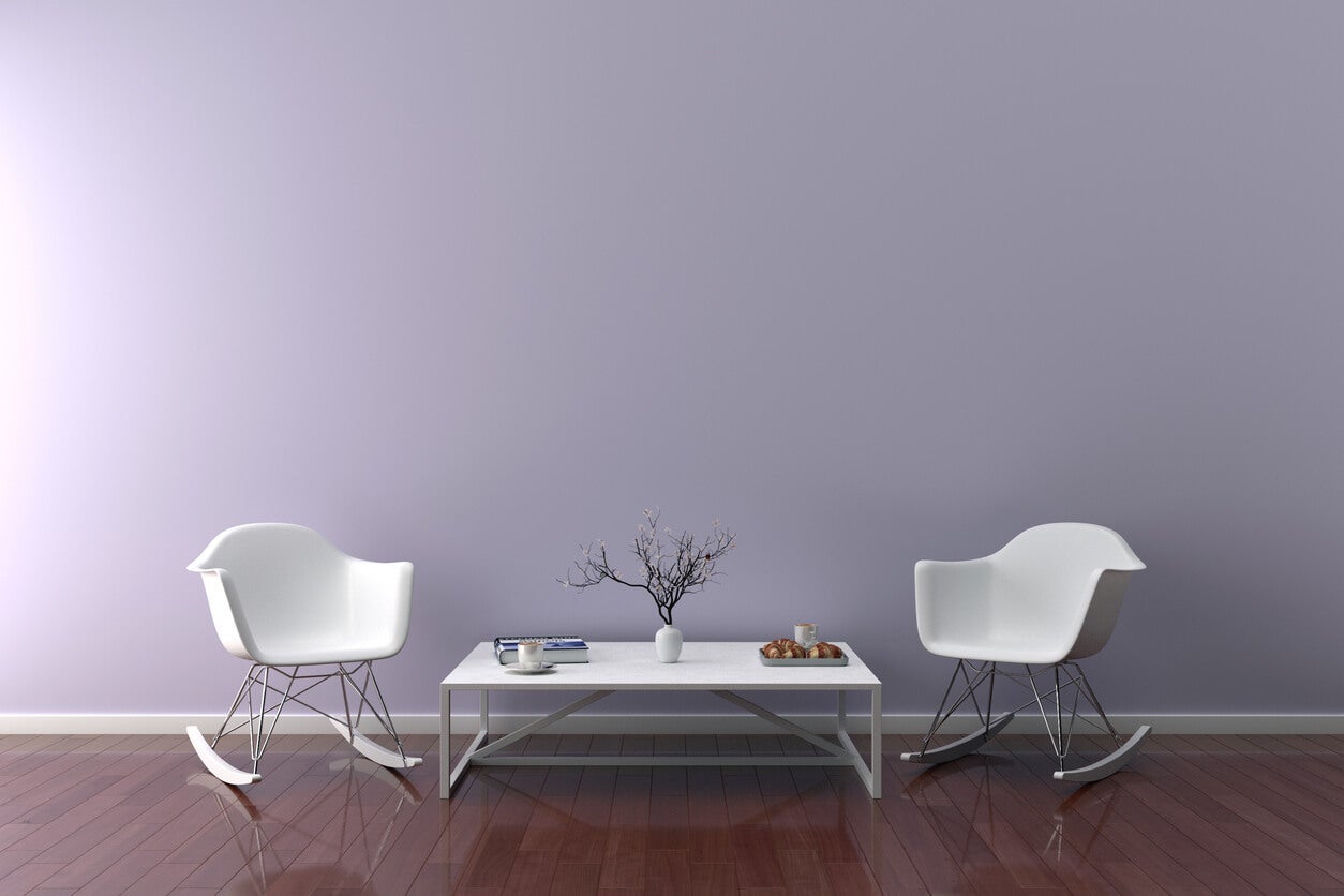
Good paint colors for dark rooms
1. Lavender
Lavender is one of the most versatile choices for a low-light room because it reads as warm, airy, and visually expansive rather than heavy. Unlike a flat neutral, it adds just enough interest to keep a dark room from feeling forgotten. For a sophisticated, non-feminine option, try Benjamin Moore Violet Mist (2071-70) --- a dusty, muted lavender with gray undertones that feels current and calming. It pairs beautifully with warm wood furniture and matte white trim. In a dark bedroom or reading nook, this shade creates a cocooning effect that feels intentional rather than dim.
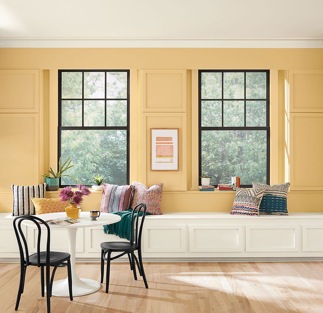
2. Sunny Yellow
When you don't have much natural light, yellow is a great way to recreate that feeling with artificial light. It's great for bedrooms or bathrooms with tiny windows. Just make sure you have enough artificial light in the room so it doesn't fall flat. Yellow pairs well with white accents and light wood details to add more warmth to a cold space.
Vibrant hues like Sunny Yellow are also some of the easiest colors to see in low light — it’s one of the many reasons taxis are painted bright yellow.
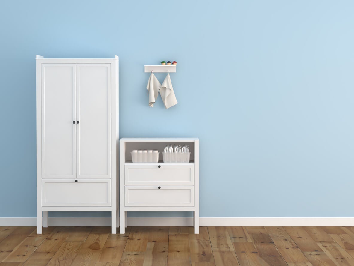
3. Powder Blue
Soft, dusty blue is one of the most effective brightening tools for low-light rooms because it evokes natural sky and open space without needing sunlight to activate it. In a north-facing or windowless bathroom, it creates an airy, spa-like feeling that flatlines under brighter, higher-saturation colors. Try Sherwin-Williams Misty (SW 6232) – a soft, cool powder blue that stays fresh under both artificial and limited natural light. Pair with white subway tile and polished chrome fixtures for a clean, bright result that punches well above the room's actual light level.
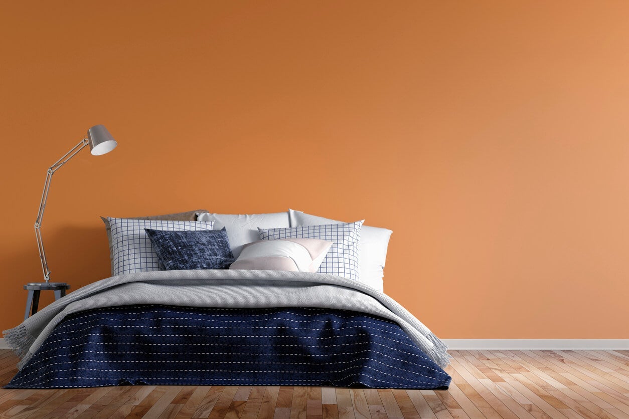
4. Bright Orange
This color might seem a bit wild, but we're not talking about safety orange here. When using orange in a dark space, think more pumpkin, tangerine, or apricot. These very warm shades work best in a dark kitchen or dining room space where people gather. Try pairing it with darker wood details with brown and white accents for a sleek look.
5. Soft Gray
Choosing the right gray for a dark room is all about warmth in the undertone. Cool blue-grays can make low-light rooms feel cold and cave-like; warm greiges give the same neutral base while adding a coziness that artificial light can amplify beautifully. Sherwin-Williams Accessible Beige (SW 7036) sits right at the edge of gray and beige and is exceptionally forgiving under lamp and overhead light. For a slightly more gray result, Benjamin Moore Revere Pewter (HC-172) is a warm khaki-gray that adds depth without darkening the room. Either works brilliantly in a dark living room, hallway, or home office.
Still not sure which shade will work in your specific room? Our free color consultation matches the right color to your actual space – artificial lighting and all.
6. Pink
Pink instantly brightens up any space and adds a whole lot of personality. We like softer pastels and rose tones to add just a hint of color without being overwhelming. However, if you want something bolder like fuchsia, stick to using it on an accent wall, since ultra-bright shades can make a room feel smaller when they're on all four walls.
What Paint Sheen Should You Use in a Dark Room?
Paint sheen can be as important as color when you're dealing with a low-light space. In dark rooms, sheen controls how much your artificial lighting bounces off the walls – and the difference between flat and satin can literally change how bright a room feels.
Eggshell (the most common sheen for walls) reflects a small amount of light while still looking natural and smooth. It's the best all-around choice for dark rooms that want a slight luminosity boost without a disco-ball effect from overhead lights.
Satin finish reflects noticeably more light than eggshell, which can be a real advantage in darker rooms – especially hallways and bathrooms where overhead lighting is the primary source. Be aware that satin shows wall imperfections and brush marks more readily, so surface prep matters.
Flat/Matte is ideal for hiding imperfections in older homes, but it absorbs light rather than bouncing it back. In rooms that are already dim, flat paint can make the space feel heavier. We only recommend it for accent walls in dark rooms, or for ceilings where you want to remove visual height.
Gloss should generally be avoided for walls in dark rooms – while it reflects the most light, it creates harsh glare from light fixtures and makes every imperfection visible. Reserve gloss for trim and cabinetry.
Ready to transform that dark, forgotten room into your favorite space in the house? Our professional interior painting services can make it happen in a single day. Book your free estimate today.
Need help choosing the right shade for your specific room and lighting? Our free color consultation matches the right color to your actual space – artificial lighting and all.
Want more inspiration? Read our other blog posts:
Easy Home Improvement Ideas to Increase Home Value | 9 Peaceful Paint Colors to Help You Relax | The Best Paint Colors For Selling A House | How To Use A Paint Color Wheel | 10 Beautiful Bathroom Paint Colors For Your Next Renovation
Frequently Asked Questions
Warm-toned neutrals and vibrant mid-tones outperform white in rooms without natural light. Sherwin-Williams Accessible Beige (SW 7036), Benjamin Moore Violet Mist (2071-70), and soft powder blues like Sherwin-Williams Misty (SW 6232) all perform well under artificial lighting. The key rule: avoid pure bright white, which looks flat and grayish without sunlight to activate it.
It depends on your goal. Light-to-medium warm tones create a brighter feel. However, in rooms used for specific moods (a cozy bedroom, a home theater, a moody dining room), embracing a dark color can work beautifully – dark teal, deep blue, or chocolate brown can feel intentional and elegant rather than just dark. Go a few shades lighter than you think – dark colors look 2 to 3 shades darker once they're covering all four walls.
Eggshell is the best all-around sheen for dark rooms – it bounces a modest amount of light from artificial sources without creating glare. Satin is a step up in reflectivity and works well in dark hallways and bathrooms. Avoid flat/matte for main walls in dark rooms, as it absorbs rather than reflects light.
Yes, but choose your undertone carefully. Warm greige-grays like Sherwin-Williams Accessible Beige (SW 7036) or Benjamin Moore Revere Pewter (HC-172) look inviting under artificial light. Cool blue-grays can feel cold and cave-like without natural light to warm them up.