May, 2025 | Color of the Month
May 2025 Color of the Month: Alabaster by Sherwin-Williams
A Soft, Serene Neutral to Welcome the Season
Spring is the perfect time for fresh starts! When it comes to transforming your home, nothing feels more refreshing than a new coat of paint. This May, we’re turning the spotlight on Alabaster by Sherwin-Williams: a soft, warm white that’s earned its place as a top pick for interior design enthusiasts and home painters alike.
Whether you're dreaming of a cozy sanctuary or a sleek, modern refresh, Alabaster offers the ideal canvas for any room. At WOW 1 DAY PAINTING, we’ve seen how the right interior paint color can completely change the look and feel of a home—and Alabaster does just that.
Why We Love Alabaster
This Sherwin-Williams interior paint color is a favorite for a reason: it delivers all the brightness of a clean white without feeling stark or cold. Alabaster carries a subtle warmth that makes it inviting, versatile, and timeless. It’s a neutral paint color that works across design styles—from modern minimalism to soft bohemian and everything in between. Its serene, almost creamy undertone makes it an ideal spring color that feels both fresh and familiar, giving your home a renewed sense of calm.
3 Ways to Use Alabaster in Your Home
1. Creative Studios & Bright Spaces
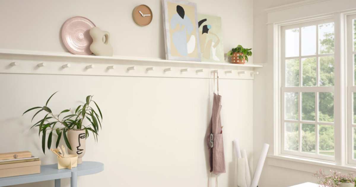
A bright and open space can spark creativity, and Alabaster is the perfect backdrop for letting your imagination take center stage. Use this color in home offices, art rooms, or sunrooms where natural light can reflect off the walls and create an airy atmosphere.
Design Tip: Pair Alabaster walls with light oak furniture, sun-bleached textiles, and soft linen drapes for a natural, minimalist interior design look.
- Trend Highlight: Modern Boho
- Get the Look: Rounded edges, muted tones, organic textures.
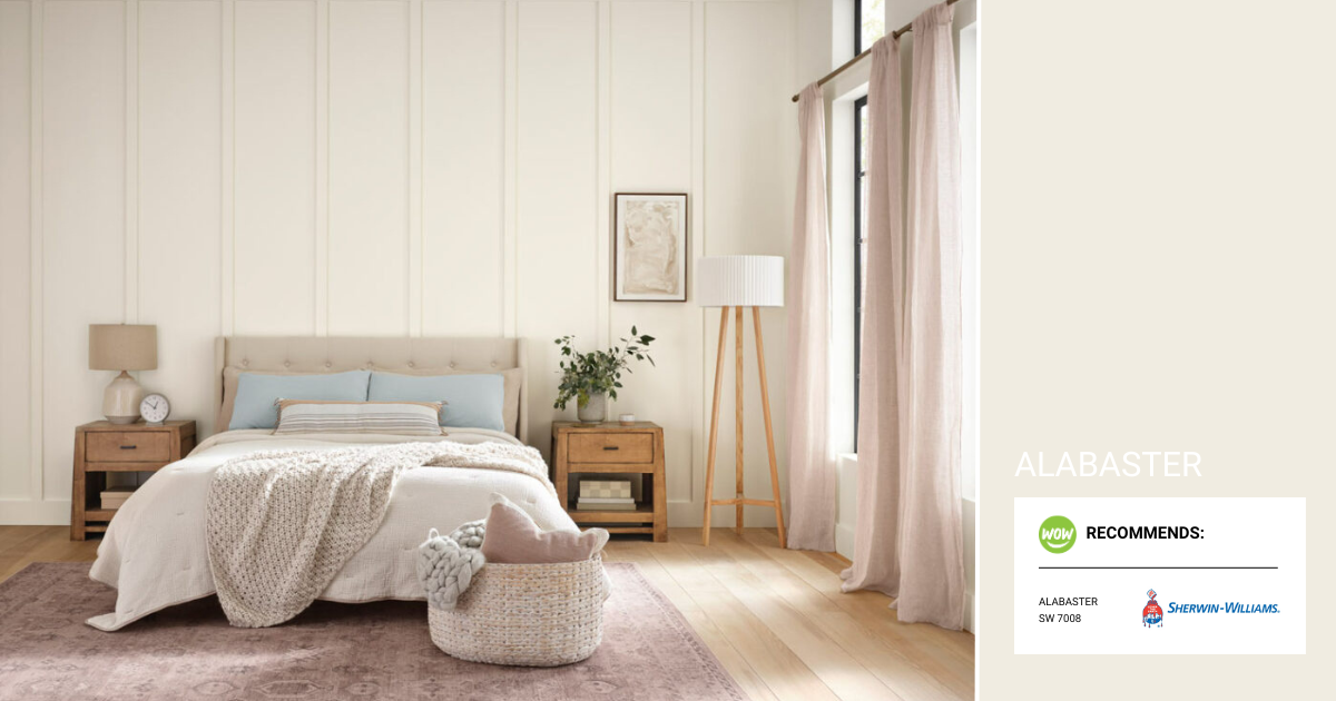
2. Bedrooms & Restful Retreats
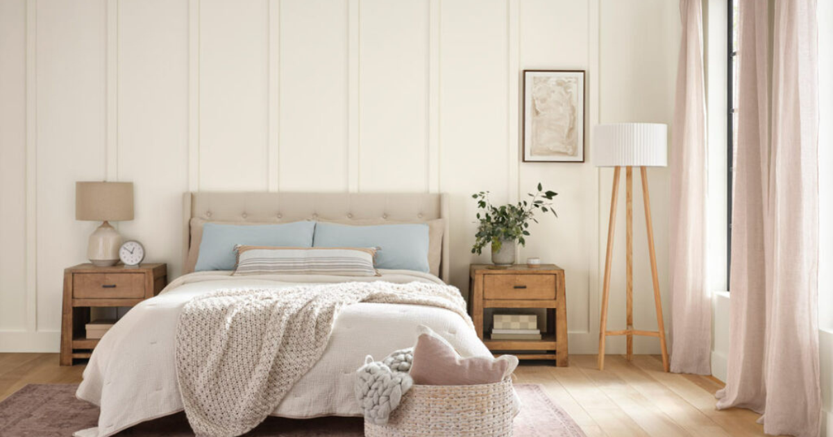
Looking to create a peaceful escape? Alabaster’s warm tone adds dimension and softness to bedrooms or meditation spaces. When layered with textures—think cozy knits, tactile throws, and woven baskets—it becomes the foundation for a deeply calming environment.
Design Tip: Try painting textured walls or ceilings in Alabaster to create a cocooning effect. Then, ground the space with rich wood accents and earth-toned décor.
- Trend Highlight: Texture Meets Tone.
- Get the Look: Warm wood, soft neutrals, layered fabrics.
3. Living Rooms & Transitional Spaces
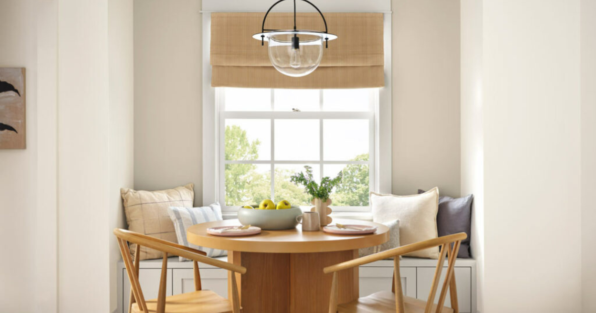
For those craving a modern yet livable aesthetic, Alabaster delivers subtle elegance. It blends beautifully with other design elements, allowing standout pieces—like colorful ceramics or curated artwork—to shine.
Design Tip: Add a fun twist by painting built-ins or trim in a coordinating pastel shade for a playful, custom finish.
- Trend Highlight: Modern Organic
- Get the Look: Pastel accents, tonal upholstery, matte fixtures.
Pair Alabaster With Coordinating Colors
To elevate your space even further, consider these Sherwin-Williams paint colors that pair beautifully with Alabaster:
- Drift of Mist SW 9166: A light, airy gray with a soft touch
- Shoji White SW 7042: A warm white with subtle depth
- Accessible Beige SW 7036: A timeless greige for added warmth
- Samovar Silver SW 6233: A cool, muted silver-gray for contrast
These shades can be used for accents, trim, or adjoining rooms to create flow and dimension throughout your home.
Ready to Refresh Your Home This Spring?
At WOW 1 DAY PAINTING, we believe in making home transformation simple, fast, and beautiful. If you’re feeling inspired by this month’s color or looking for a neutral, modern update, our team can bring your vision to life!
Contact us to learn more and discover the perfect colors for your home!