Sarah Robinson | Exterior Painting
2017 Best Exterior House Color Schemes

Is the outside of your house ready for an update? When it's time to paint your home's exterior, it can be tempting to stick to the status quo. But what's the fun in that? It's important to keep in mind that most people only paint the outside of their homes once every 10 years or so, which is a pretty long time to live with just one look. So when you're ready to change things up and give your home a fresh new look, there are a few things you should consider.
7 Exterior Color Schemes That Will Refresh Your Home
1. The classics
If you know you'll need your next paint job to last for awhile, going with neutrals is your best bet. Experiment with variations on tones of beige, sand, and white to create a truly timeless look that will never look dated or out of place. It also makes it easy to make quick style updates throughout the years-you can easily change up your accent colors on doors and shutters without changing the base color of your home. To make this color palette a little more modern and exciting, choose two or three shades of the same color as accents.
2. Interesting accents
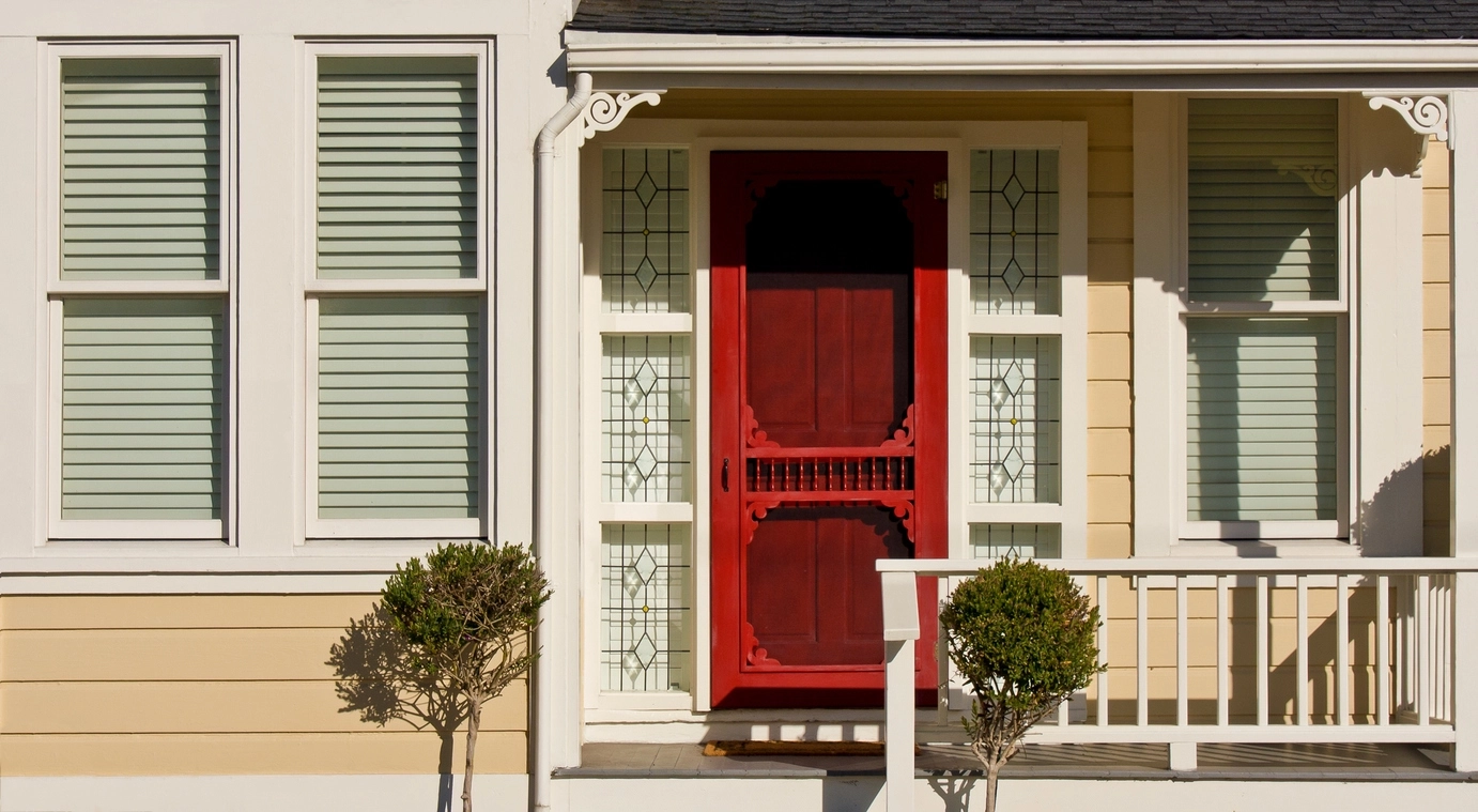
If you've gone with a more neutral shade for your home, you can liven things up a little by choosing brighter accent colors. To make it even more dynamic, try choosing a couple of versions of the same color instead of just one accent shade. An example would be using a bright blue door with a more muted lavender gray tone for the shutters. If you decide to go for a super bold accent, don't get carried away-a red door doesn't need matching red accents anywhere else. Choose one color that really pops, and keep the other accents more muted.
3. Play with primary colors
Can't quite figure out how to balance those bold and bright accents? Go back to basics, and use the color wheel for inspiration! If your base color is a more neutral blue, what colors will really make it pop? Complementary colors are on the opposite side of the wheel, so in this case, a bright yellow or orange would create a perfect balance. You could also go with a more monochromatic look, and choose a lighter or brighter version of your base color as an accent. You could also try an analogous color scheme, which uses two to six colors that are next to each other on the wheel, such as red, orange, and yellow.
4. Keep it natural
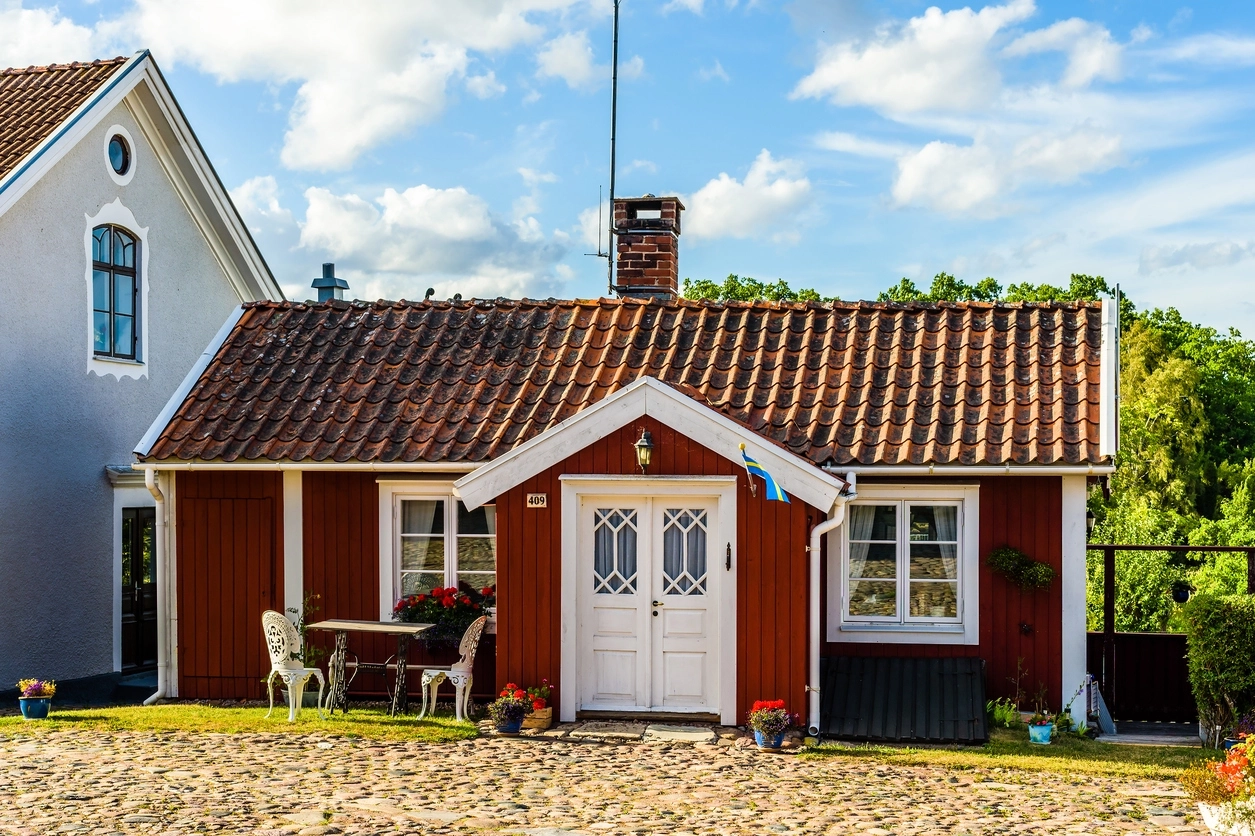
Natural is different than neutral. This look lets you use the natural colors of wood and other materials to create your look. If you've got wood siding or any other wood elements, you can stain it to show off the natural grain, while adding a bit of color at the same time. This style is especially nice when you have stone or concrete on the outside of your home. As for accents, go with cooler shades of gray or white to really showcase the natural elements.
5. Go dark
If you're after a truly bold look, try going to the dark side. A rich shade of purple or blue can look very chic if done right. The key to using dark colors is to be careful not to make your home look too imposing. Choose lighter accent colors to warm things up a bit, or try using the darker color on the bottom half of the house only. Darker colors are a great way to make a smaller house seem more substantial. Beware of going too dark on a larger house, though. You don't want to make your home look scary!
6. White out
If color really makes you nervous, go with a no fail: white. This option certainly doesn't have to be boring, though. Instead of sticking to blindingly bright white, experiment with a few shades to create some subtle contrast. Try a warmer cream shade as your base, with bright white trim, and a grayish white on the shutters. It's a safe look that will stand the test of time, while still giving some texture and visual interest.
7. The new neutral
When you hear the term neutral, you're probably thinking of those classic beige and white tones we mentioned earlier. That's not what we mean. These days, it's all about the new neutral: muted versions of brighter colors. This color theme lets you embrace color without getting too crazy. Lighter greens, blues, and yellows can function as neutrals if you pick the right shades. They're richer than pastel shades, and not as vibrant as you would typically imagine. It's a perfect way to create a contemporary look that won't look dated before you're ready to paint again.
Find the Exterior Color Scheme That Matches You
Before committing to a color scheme, you'll want to give careful consideration to what kind of look you're going for. Do you want something bold, or something more muted and classic? Are you going for a contemporary style, or a more traditional and timeless look? If you're having trouble figuring that part out, there are a few places to look for inspiration.
Use your environment
Where do you live? What does the space around your house look like? There are certain color palettes that work best in certain environments. For example, if you're in a desert climate, earthy tones are going to help your home blend in with its surroundings. If you're going for a high-contrast look, choose bolder accent colors like yellow, red, or turquoise. For a more lush, green landscape, lighter neutral tones will actually make your home stand out more against the forest backdrop. For beachy locales, washed-out tones of blue, green, and yellow are a perfect way to blend with the surroundings.
Consider other house components
What other materials are featured on your house? Any exterior paint colors should match up with your roof, and any brick or stone on the outside of your home. Brick and stone come in a variety of colors; some are peachy brown; others are bluish gray, and others are reddish rust. Your paint color should match those undertones to create a cohesive look-pair cool undertones with a cool color, and warm undertones with warmer colors.
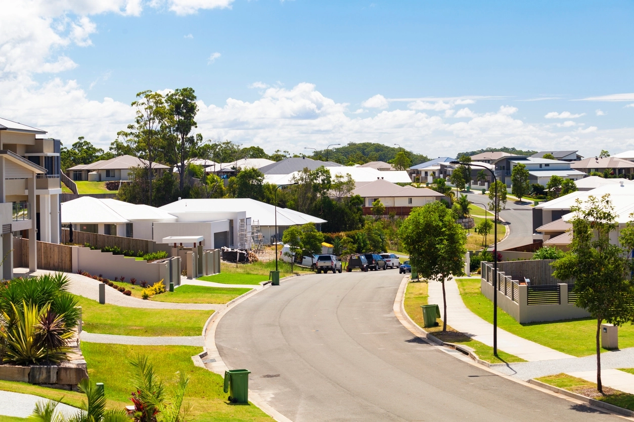
Take a stroll around the neighbourhood
See what's going on color-wise in your neighborhood. While you don't necessarily have to go with the exact same color scheme as all your neighbors, you probably don't want to choose a tone that is going to clash with the rest of the houses. It's fine to choose something a little different, but you should make sure it complements the look of the rest of the neighborhood.
Think about structure
What is the architectural style of your home? Each design style lends itself to a different color palette. For example, a Victorian style home can handle bright and bold colors, while a modern west coast design definitely calls for neutral gray and wood tones. When in doubt, keep things on the more neutral side-it's almost always a safe bet. This way, you can highlight cool architectural details with brighter accent colors. (A bright and bold front door is always a fabulous look!)