January, 2026 | Color Trends and Inspiration
Inspire Simple Yet Total Contentment
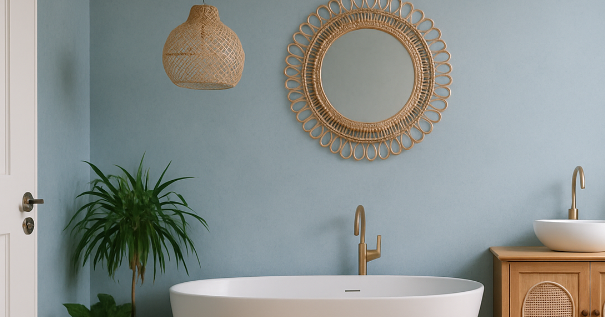
There’s something effortlessly calming about a soft blue done right. Upward by Sherwin Williams captures that feeling with ease. Light, airy, and endlessly soothing, this shade brings a sense of quiet optimism to any space. It feels like a deep breath, a clear horizon, and a moment of calm all wrapped into one.
Perfect way to start the new year, anyone?
Upward has a timeless quality that works beautifully across a range of interiors, especially when the goal is to create a space that feels peaceful, welcoming, and thoughtfully designed.
Why We Love Upward
Relaxed: Upward has a gentle presence that never overwhelms a room. It softens the space while still feeling intentional and refined.
Breezy: This pale blue reflects light beautifully, helping rooms feel open, fresh, and full of air. It is an ideal choice for spaces that crave brightness without stark white.
Classic: While it feels fresh and modern, Upward has lasting appeal. It is the kind of color that feels just as right today as it will years from now.
See How We Brought Upward to Life
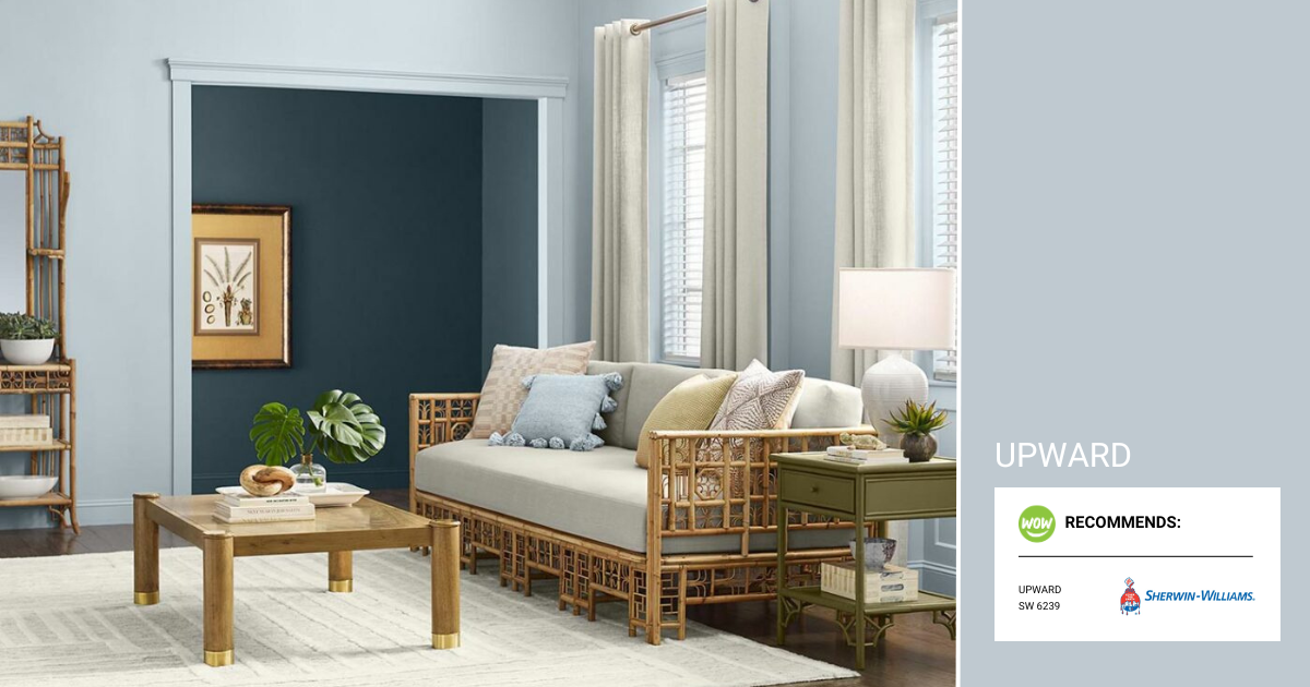
1. Simple Serenity
Upward shines when simplicity leads the design. Its soft blue tone brings a quiet energy into living spaces, creating an atmosphere that feels light, open, and grounded at the same time. The color naturally evokes coastal calm, making it a beautiful choice for rooms inspired by the sea, sky, or open landscapes.
When paired with deeper accent tones, such as a rich marine blue, the space gains balance and depth. This contrast keeps the look from feeling too light while maintaining a relaxed, lived-in warmth
Get the Look: Natural fabrics, mixed textures, light wood tones, greenery

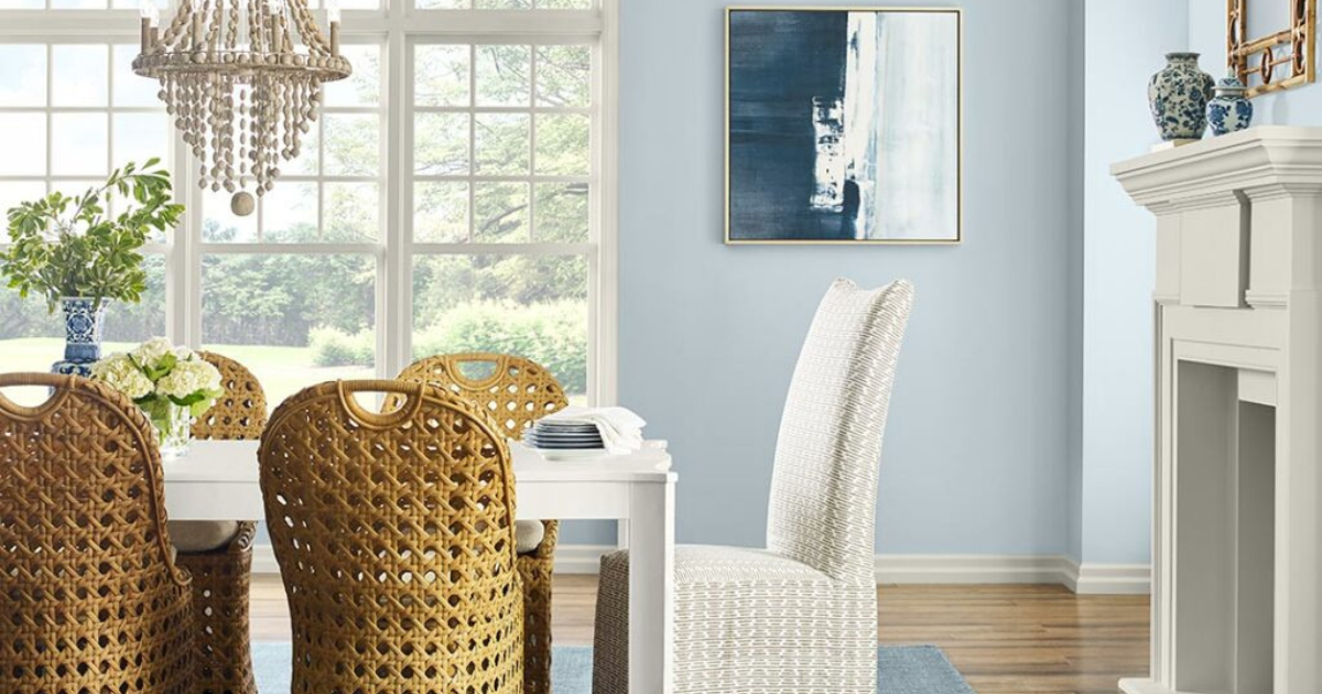
2. Keeping it Casual
Upward feels right at home in relaxed dining spaces and modern coastal interiors. It works as a clean, calming backdrop that allows natural materials and simple furnishings to take center stage. The result is a space that feels casual but still thoughtfully pulled together.
Paired with woven textures, soft neutrals, and natural wood finishes, this color brings an understated sophistication that never feels forced. It is an easy choice for homeowners who want their space to feel inviting, comfortable, and timeless.
Get the Look: Wicker furniture, greenery, weathered wood accents, clean lines
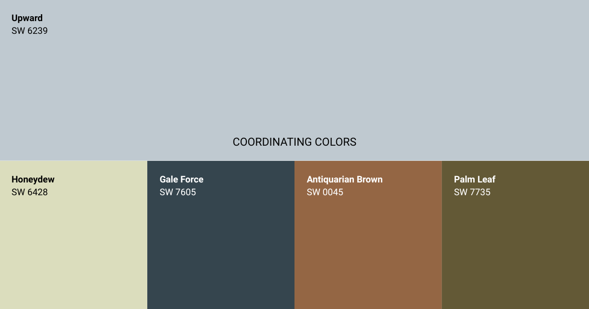
Pair Upward With These Coordinating Colors:
- Honeydew SW 6428: A soft, muted green that adds freshness and light without competing for attention.
- Gale Force SW 7605: A deep blue that grounds the space and adds contrast and visual weight.
- Antiquarian Brown SW 0045: A warm brown that introduces richness and classic charm.
- Palm Leaf SW 7735: An earthy green that brings depth and a natural, organic feel.
Ready to Brighten Your Space?
Upward is all about ease, lightness, and timeless calm. WOW 1 DAY PAINTING is ready to bring this serene blue into your home, delivering Picture Perfect results in just one day with minimal disruption.
Book your complimentary consultation at wow1day.com and see how Upward can refresh your space with an effortlessly relaxed feel!