


Every year, designers and painters eagerly await the announcement of the Pantone Color of the Year. It really does set the tone for design trends in the coming year, and is a great way to get a little inspiration. So what color was the winner for 2017?
Introducing, Greenery! (PANTONE 15-0343)
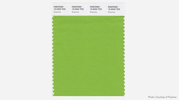
This fresh and zesty shade of yellow-green is inspired by nature, of course, and will instantly elevate the mood in any room. On a cold winter morning, it will have you fondly thinking of warm spring days. Inspired by the gorgeous colors of lush green forests, it helps to bring elements of the great outdoors, indoors. It's a choice that is also reflective of what's going on in the world right now-it symbolizes new beginnings, and is reflective of the interest in "going green" and adopting healthier lifestyles.
Since it's on the bright side, it works wonderfully as an accent color, and pairs well with just about any color palette you can think of. We love it paired with dark grays and moodier hues to add a burst of brightness, or with softer neutrals to let it really pop. Or you could really go bold and pair it with other brights, to create a room that bursts with happiness and energy.
Let your imagination run wild and create a room you love, with a little touch of springtime to keep you smiling all year long. We're looking forward to working with this incredibly cool color, and can't wait to see what looks our clients dream up.
More color palette info here.